Project Summary
BEFORE

AFTER

When users browse commonly stocked household goods such as cleaning and beauty products, they are offered a discounted price for subscribing to a product in order to encourage multiple sales.
The information provided on the item page often fails to provide shoppers with what they need to make decisions to purchase individual products.
The redesign of the Item Page and check-out experience serves to encourage the subscription model and allow users to navigate through various product options from the item page.
Problem and Motivation
THE PROBLEM
Analytics show users are not utilizing the subscribe feature when adding items to their carts.
User testing for our initial launch of the website indicated issues with user retention when shopping for specific items.
Users expressed wanting to easily navigate back to specific item categories without having use the nav bar.
USER GOALS
We want to maintain user retention while shopping for specific categories of items to make the overall experience less time consuming and more organized.
We want to give the user all the tools to become informed shoppers.
BUSINESS GOALS
Analytics show users are not utilizing the subscribe feature when adding items to their carts.

Data analysis and a focus group with five users shaped the following design principles:
Design Principles

SPEED
We want users to navigate through different item categories quickly and with ease.

COMPELLING
We want users to be compelled by the design and information to encourage purchases.

INFORMATIVE
We want users to have as much information as they need to make informed purchases.

SPEED
The search bar is more noticeable to draw user attention for faster navigation
Category hierarchy is tracked and displayed at the top of the item page to show users where they are in the shopping process.
COMPELLING
Information is organized by font, font size, and color.
The reorganization of the item page was preferred by all 8 users in user testing session.
Buttons and important discount information are bright green to stand out and encourage purchases.
INFORMATIVE
The "other buyers also bought” feature allows users to see more similar products and allow users to make rational decisions rather than emotional ones.
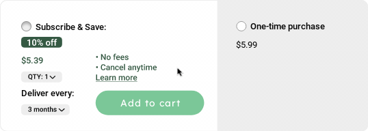
INFORMATIVE AND USER-FRIENDLY SERVICE
The redesign of the subscribe feature allows users to see all the information they need to make an informed subscription purchase without experiencing information overload. If they are not interested in the subscription offer, they can simply select the “one-time purchase” button, and will not see the complete subscription service information.
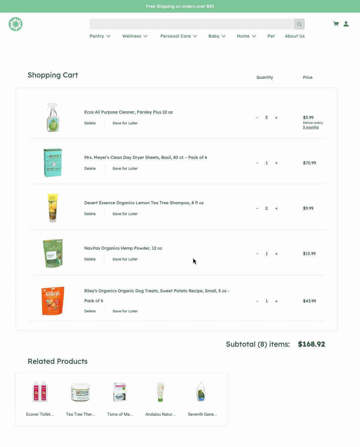
THE CHECKOUT PAGE
The redesign of the checkout page provides less information about the subscription service directly in the cart. Users expressed a dislike of the clutter and disorganization of the previous checkout experience. Previously, users could see but not edit subscription information in the check out and had to go back to the item page to make changes.
The re-design allows users to click on the subscription time period to see a popup of the available subscription periods.
It also features related products for users to quickly add to their carts before checking out.